Having a Knowledge base on your website can be an extremely valuable asset both for your customers and your employees. And if done right, a knowledge base can become a long-standing hallmark of quality assurance for your business. They can be a great solution for FAQs, Documentation, Software manuals, Tutorials, and much more.
In this tutorial, I’m going to show you how to add a knowledge base to your website with Divi. To do this, I’ll be using the Echo Knowledge Base plugin (free version) which has some helpful configuration options that make it easy to organize and style your knowledge base pages. I’ll also show how you can style the knowledge base main page and article pages using the Divi Builder.
Sneak Peek
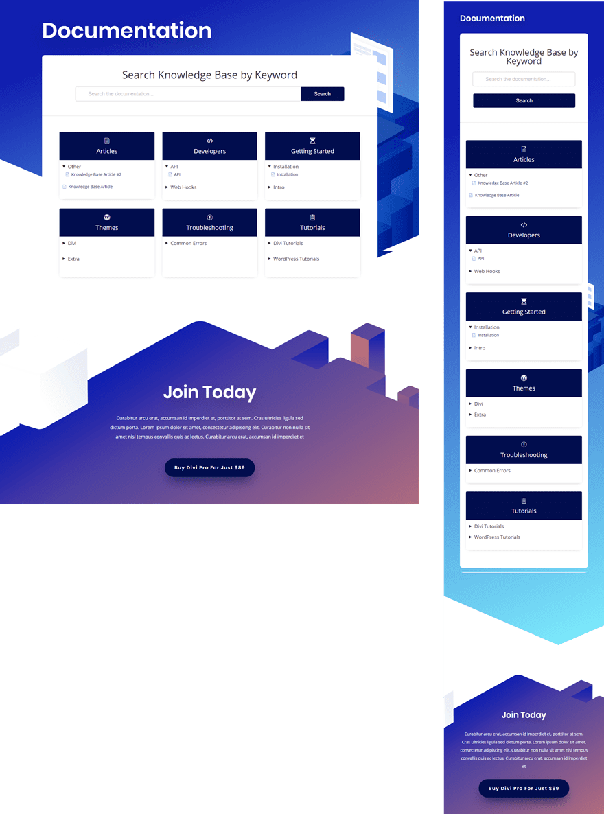
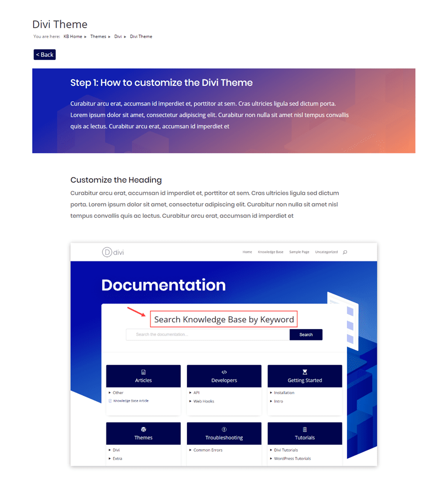
Here is a sneak peek of what we will be building.
The Main Knowledge Base Page
Sample Article Page
What You Need for This Tutorial
- The Divi Theme (Installed and Active)
- The Echo Knowledge Base Plugin (Installed and Active)
- The Digital Product Layout Pack (Available for FREE within the Divi Builder)
Enable the Knowledge Base Post Type in Divi
Divi makes it easy to provide support for certain third party custom post types. Since the knowledge base plugin uses their own post types for articles, you will need to enable them in Divi. This will allow you to use the Divi Builder to edit those articles.
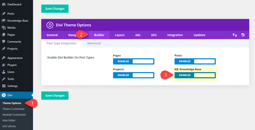
To do this, go to your WordPress Dashboard and navigate to Divi > Theme Options. The click the Builder tab and enable the post type “KB: Knowledge Base”.
Creating the Knowledge Base Articles and Categories
In order to get a good idea of what the design will look like, you will need to have some Knowledge base articles and categories setup. For now, it is okay to use mock content.
Creating your Knowledge Base Categories
You can create knowledge base Categories just like you would for normal post categories in WordPress.
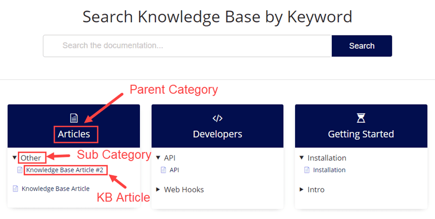
To do this, navigate to Knowledge Base > Categories. Then add a Name, Slug, and Parent Category (if applicable) for each of the categories you are going to use for the knowledge base articles. For this example, I added 6 parent categories each with a couple of subcategories.
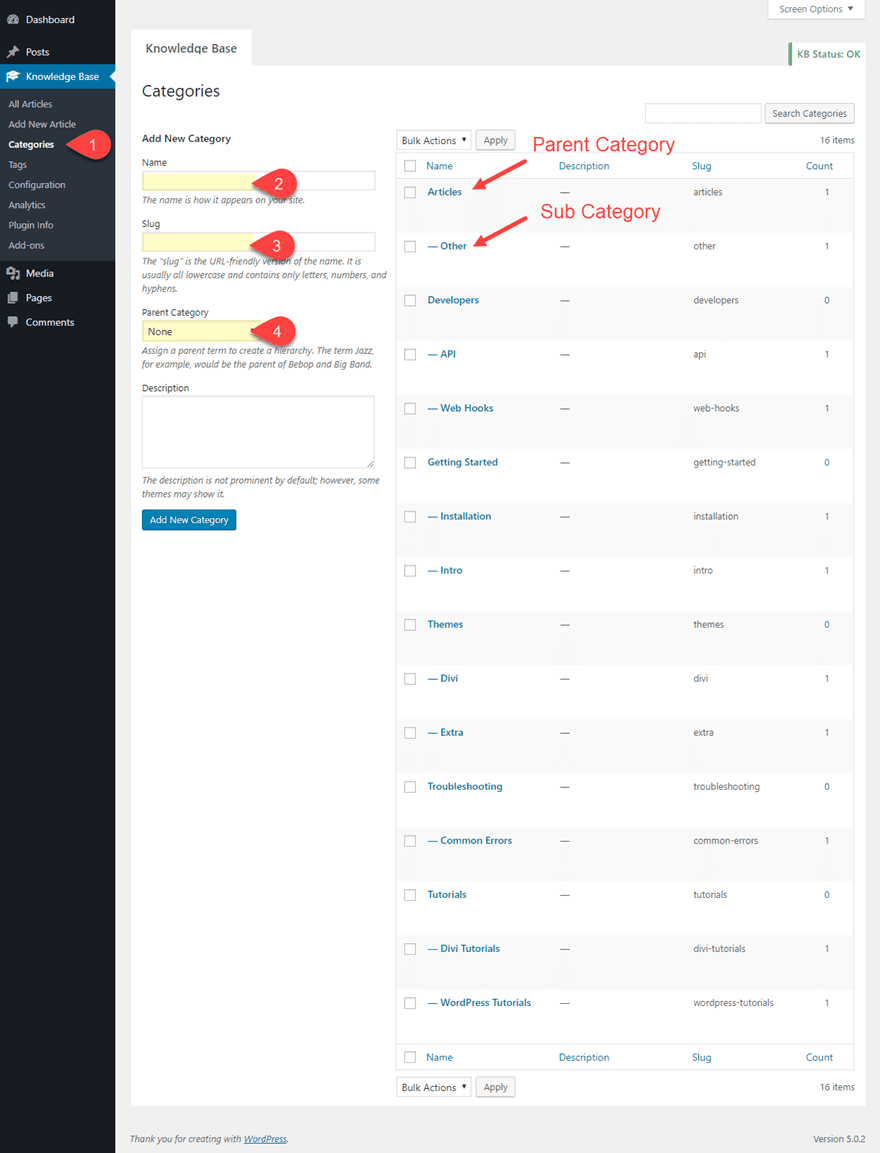
To give you an idea of where this is going, here is how the Parent Categories and Subcategories will be displayed on the knowledge base main page.
Assigning Categories to New Articles
Right now your categories are in place but there are no articles assigned to them. You will need to create articles and assign one (or more) of the categories you created to each one.
You can create a new article just like you would a new post in WordPress. Navigate to Knowledge Base > Add New Article. Then add a Title and assign a category to the article. You will notice the Divi Builder can be activated because we enable this post type in Theme Options. I’ll share some tips for doing this later. But for now, you can just add some mock content default WordPress editor. After that publish the article.
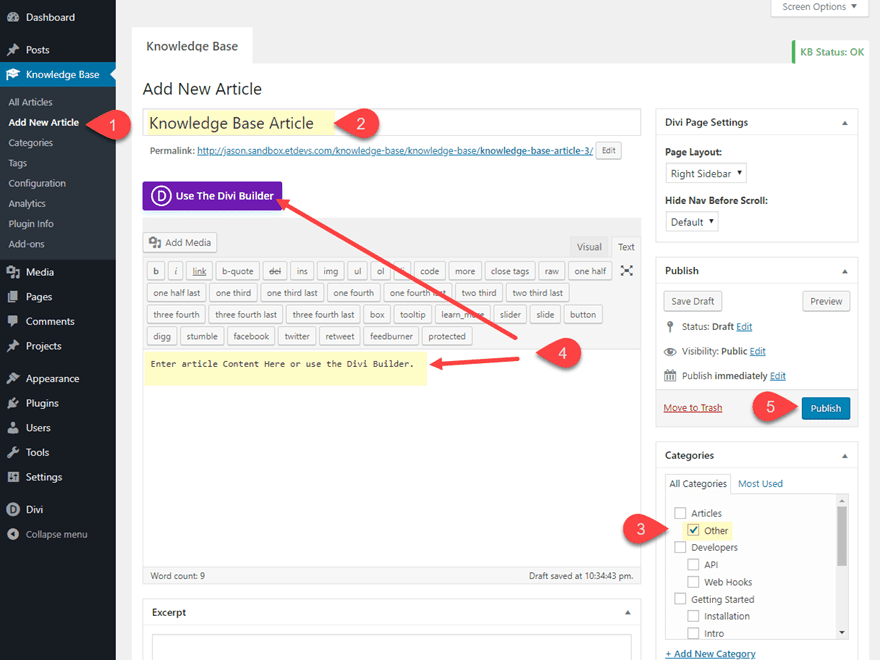
Continue this same process to create all of the articles needed so that each category has at least one article assigned to it.
Check The Default Knowledge Base Page
Once you activate the plugin, a knowledge base page is automatically created for you. This page has the necessary shortcode needed to deploy the main knowledge base.
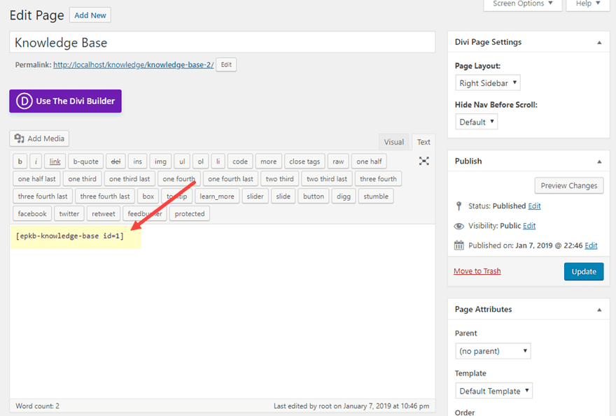
Here is what the page will look like by default.
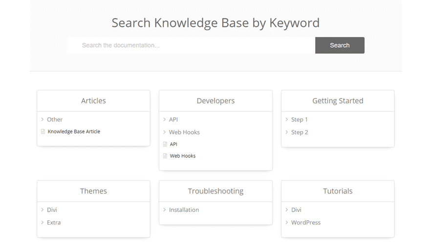
Configuring the Knowledge Base Layout and Style
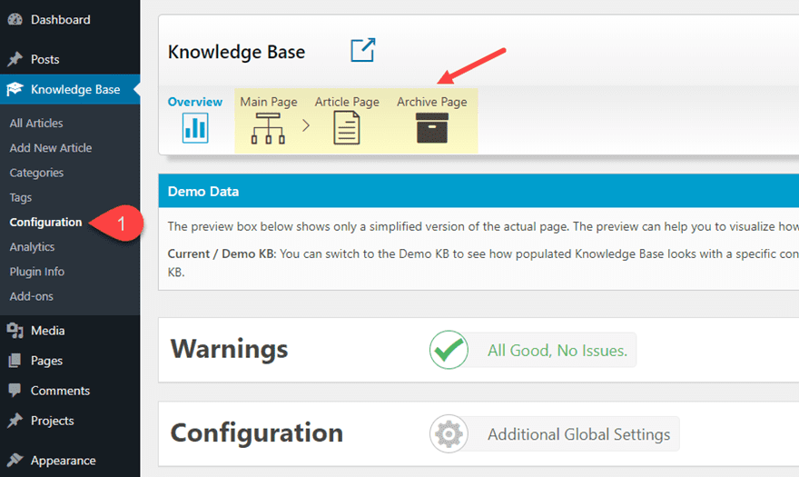
The knowledge base plugin has a lot of useful options for configuring the knowledge base to match the design of your website. There are customizable options for the Main Page, the Article Page, and the Archive Page.
Configuring the Main Page
Main Page Setup
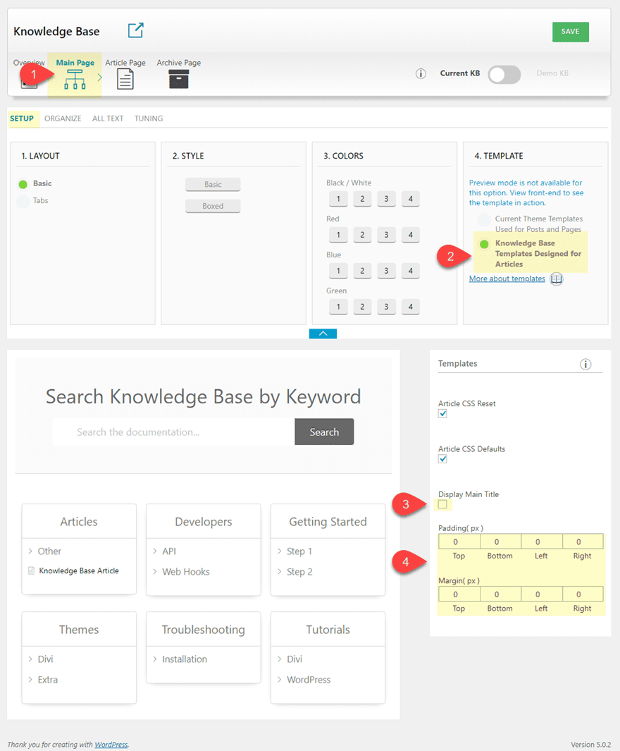
First, click on the Main Page button at the top of the knowledge base configuration page. Under the setup tab, you can leave the default layout style and colors. But for this example, I’m going to change the template option to use the “Knowledge Base Templates Designed for Articles”. I do this mainly because it allows you to customize the Archive Page with different premade style options. But, if you want to keep the Divi Theme Templates for this, you can keep the option selected to “Current Theme Templates Used for Posts and Pages”.
In the Templates popup, deselect the Display Main Title option and set the all paddings and margins 0px. This will allow us to use the Divi Builder for the page title and spacing.
Main Page Organize and All Text options
For now, I’m going to leave the Organize and All Text options to their defaults, but feel free to change those on your own. Under the Organize tab, you can even drag and drop your categories in whatever order your want. And the All Text options allow you to change the wording used throughout the page (i.e. the search Title and button text).
Main Page Tuning Option
Next, click the Tuning tab. This is where most of the styling takes place for the main knowledge base. I’m not going to use all of these settings, but I will change up some colors and add some icons. This how you can match the knowledge base with your premade Divi Layout. Since I plan on using the Digital Product layout pack, I’ll be using those colors to style the knowledge base page.
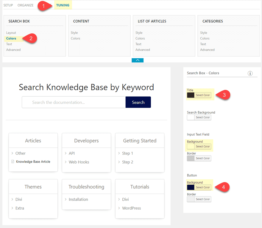
Search Box Colors
Under the search box category, select colors and update the following:
Title: #333333
Search Background: #ffffff
Button Background: #091c4f
Content Style
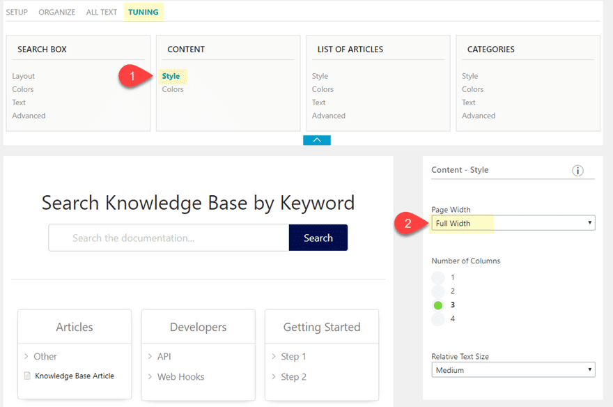
Under the Content category, select Style and update the following:
Page Width: Full Width
List of Articles Style and Colors
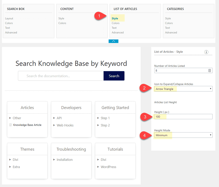
Under the List of Articles category, select Style and update the following:
Icon: Arrow Triangle
Articles List Height: 100px min height (this is useful for making all boxes the same height)
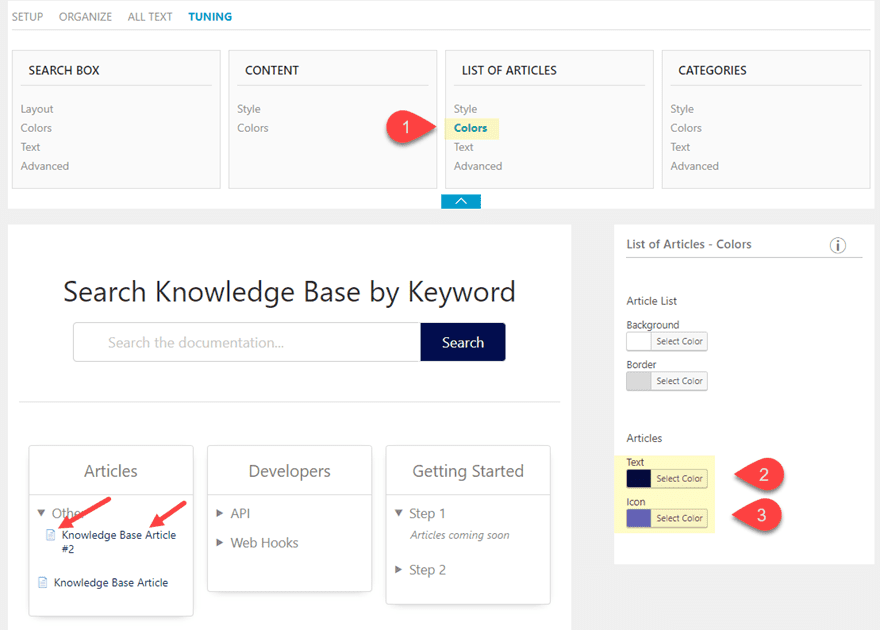
Then select Colors and update the following:
Articles Text: #091c4f
Articles Icon: #6767ef
Categories Style and Colors
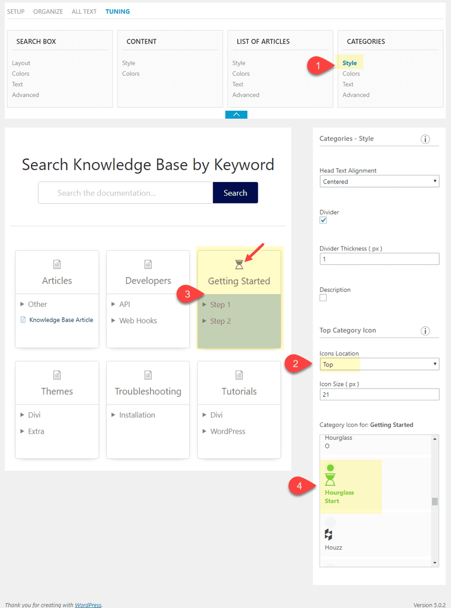
Next, under Categories, select Style and update the following:
Icons Location: top
Then Click on one of the category boxes in the preview to select it. Then select a Category Icon that specific category. Do this for each of the Category boxes.
There are over 500 icons to choose from!
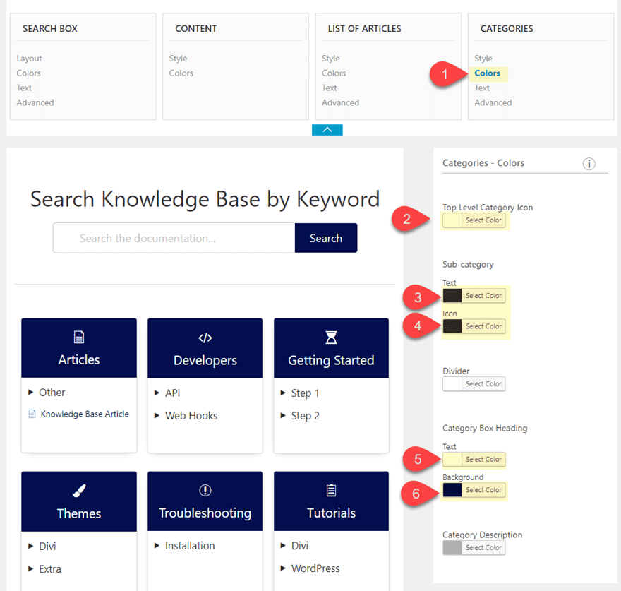
Then select Colors and update the following:
Top Level Category Icon: #ffffff
Sub-category Text and Icon: #333333
Divider: #ffffff
Category Box Heading Text: #ffffff
Category Box Heading Background: #091c4f
Article Page Features
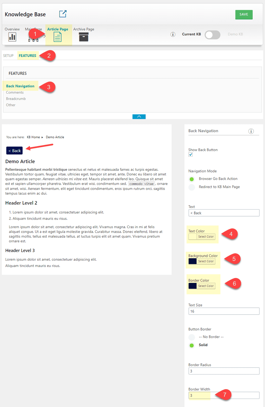
Now that we have the Main Page configured, click on the Article Page at the top of the page. Then click on the features tab. Here you can customize elements like the back button and breadcrumbs which will show up at the top of the article layout.
For now, I’m just going to match the back button with the premade layout I’ll be using for the article page. Under Features, select Back Navigation and update the following:
Text Color: #ffffff
Background Color: #091c4f
Border Color: #091c4f
Border width: 3px
Archive Page Layout Style
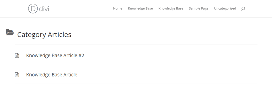
To change the layout of the archive page, click “Archive Page” at the top of the page. Under the setup tab, you will see a drop down list of the different styles available. I’m keeping the defaults but feel free to experiment with the other styles.
Here is an example of what a category archive page looks like with the default Style 1.
Designing the Knowledge Base Page with Divi
Now that we have completed the configuration of our Knowledge base pages, we are ready to complete the design of the knowledge base main page with the Divi Builder.
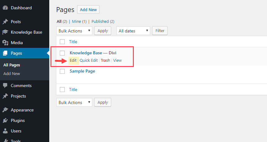
First, go to edit the page Titles “Knowledge Base” that was created automatically by the plugin.
Then Deploy the Divi Builder. Select the option “Choose a Premade Layout” and then from the Load from Library popup, select the Digital Product Layout Pack. Then deploy the Documentation Page Layout to the page.
After the layout loads onto the page, select “Build on the Front End”.
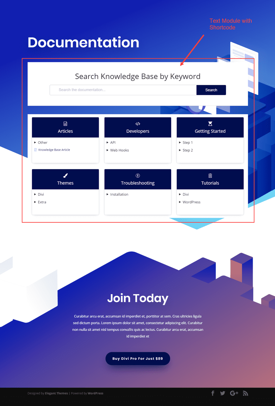
You will see that the top section holds the text module with the shortcode that displays our newly styled knowledge base.
Now all we need to do is move it to the place we want it to be within the premade layout and adjust the design as needed with the Divi Builder options.
For this example, I moved the text module holding the KB shortcode directly under the text module with the Title “Documentation”.
Then I deleted everything until the only thing I had left was the top section containing one row with the “Documentation” Text Module and the text module containing the shortcode. I also kept the bottom section with the CTA.
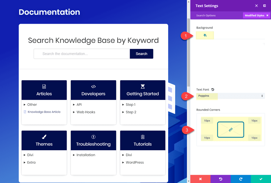
To finish off the design, open the settings of the text module containing the shortcode and update the following:
Background Color: #ffffff
Text Font: Poppins
Rounded Corners: 10px
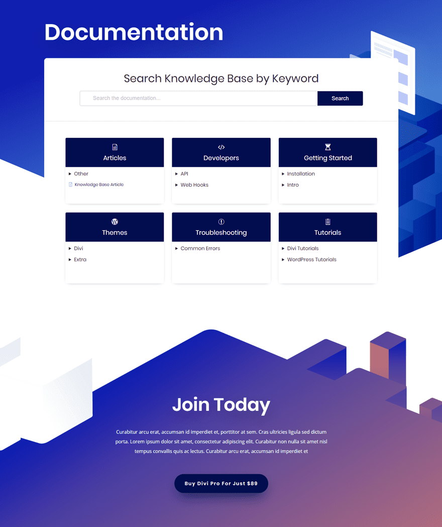
Here is the final design.
And it also adjusts nicely on mobile as well.

Designing the Article Page Using the Divi Builder
Because we activated the KB Knowledge Base post type in Divi Theme Options, you can design your articles using the Divi Builder. The Knowledge base article template does limit the Divi Builder to the content under the Page Title and Breadcrumbs, and back button. It also limits the divi builder content to a max width of 1080px.
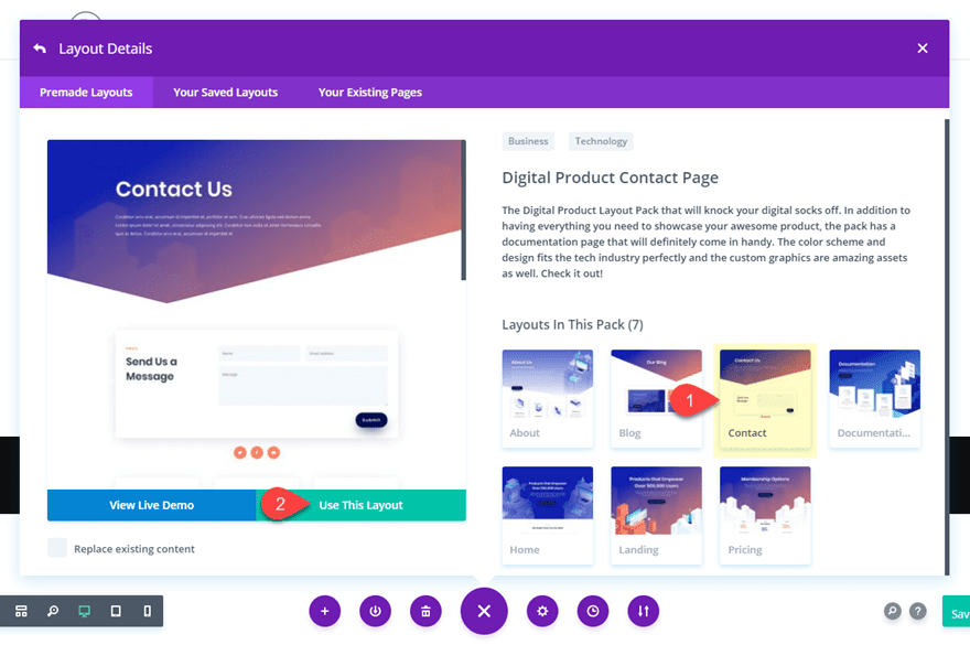
For this example, I’m going kickstart the design of a knowledge base article with a premade layout. To do this, go to edit one of the articles and deploy the Divi Builder. Select “Choose a Premade Layout” and from the Load from Library Popup, select the Digital Product Layout Pack and deploy the Digital Product Contact Page.
Now look at what the article looks like. Notice that the Divi Builder content sits directly below the Article Title, Breadcrumbs, and back button which are not customizable by the Divi Builder.
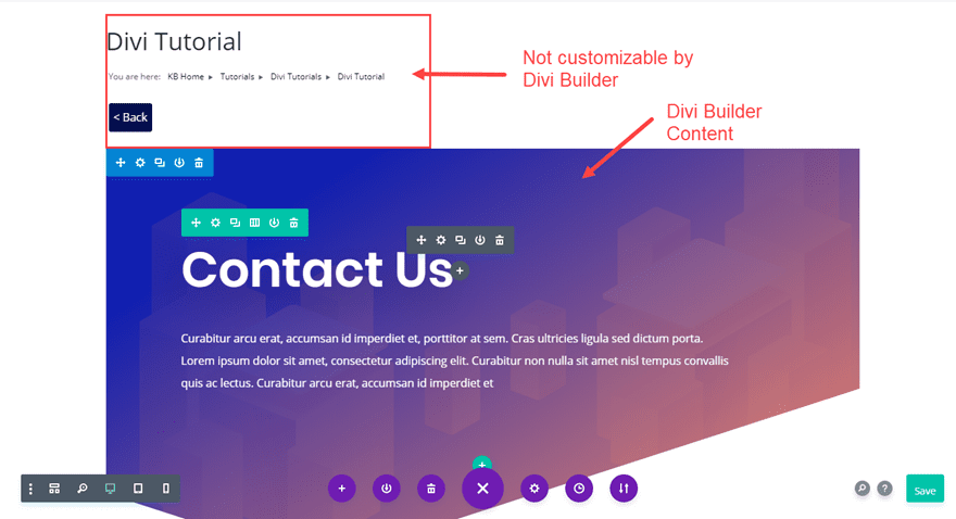
But you still have some powerful customization options for the content that does allow the Divi Builder. You can use the top section background of the contact page layout to search as a section background for the different sections (or steps) of the article. And you can easily add screenshot using the image module. Basically, you have the limitless potential of the Divi Builder for the entire article.
Here is a simple example of what an article page designed with Divi could look like.

Of course, you could add some custom CSS adjust the width of the article container in order to get a full width layout. And you could add some code to hide the Title and then use Divi’s dynamic content to place the article title anywhere you want within the Divi Builder.
Final Thoughts
The Echo Knowledge Base plugin is surprisingly powerful, even without all of the premium addons available (they are worth checking out though).The configuration options allow you organize and style your knowledge base pages to match your Divi layout easily. To top it off, you can even use the Divi Builder to design your knowledge base page and article page. I hope this tutorial was helpful for those looking to add knowledge base to your Divi website.
I look forward to hearing from you in the comments.
Cheers!
The post How to Create a Knowledge Base for Your Website with Divi appeared first on Elegant Themes Blog.
0 Comments